Creating a Scalable Brand Identity for Prince Education
A franchise-ready logo system that represents martial arts, languages, art, and more—not just one program.
Overview
Prince Education offers martial arts, painting, Chinese, English, and French programs for children and families across Greater Vancouver.
As the organization expanded into new locations, it needed a logo for its full program range—not only martial arts.
Franchise-ready brand identity
Challenge
The original black-and-white logo was strongly tied to martial arts. It didn't communicate the academic, creative, and physical programs Prince Education actually offered.
Parents couldn't see the full scope at a glance—and the mark lacked the energy and flexibility needed for multi-location expansion.
- Brand felt narrower than the actual business
- Parents couldn't understand the full program range
- Visual identity lacked expansion-ready flexibility
- Hard to apply consistently across locations and materials
Strategy
We started with interviews, competitor research, and concept testing to learn what parents valued and what would build trust.
The direction centred on three qualities: growth (upward arrow and forward movement), artistry (colour and geometric forms), and passion (energetic orange accents). The letter P anchored the mark to the Prince Education name.
- 1
Growth: upward arrow and forward movement
- 2
Artistry: multiple colours and geometric forms
- 3
Passion: energetic orange accents
- 4
Geometric shapes representing learning areas in one system
Execution
The final logo combined a stylized P, a growth arrow, and geometric elements in blue (trust), orange (passion), and green (development)—with a modern, accessible type system.
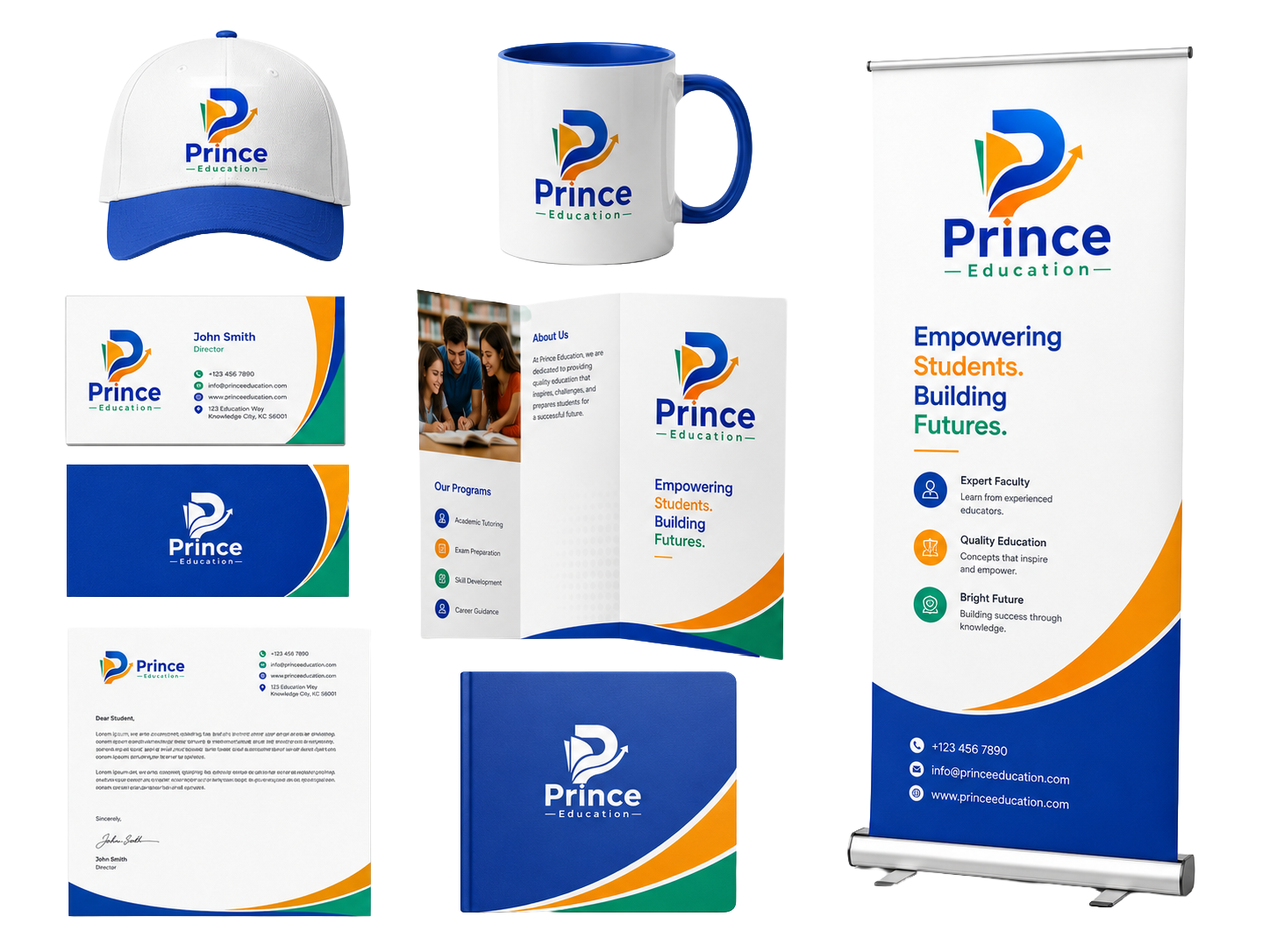
We delivered horizontal, stacked, icon-only, full-colour, and black-and-white versions, tested across website, signage, uniforms, brochures, caps, and social media.
- Stylized P logo with growth arrow and geometric elements
- Blue, orange, and green colour system with typography rules
- Horizontal, stacked, icon-only, and one-colour logo files
- Applications tested on web, print, apparel, and signage
Result
Parents, students, and staff responded positively. The identity communicated a broader, modern learning experience and supported franchise expansion with a consistent visual system.
Brand recognition
Stronger, more memorable mark
Parent trust
More professional appearance
Program clarity
Full learning range represented
Brand consistency
Unified across all touchpoints
Franchise readiness
Scalable for new locations
- The logo represents creativity, learning, and growth—not one program
- Consistent identity across print, digital, apparel, and signage
- Ready to scale across Greater Vancouver locations
Next step
Want a result like this for your business?
Tell us what you are trying to improve — visibility, leads, conversion, or brand clarity — and we will recommend the most practical next step.