Your advertisement is finally running.
People are clicking from Burnaby, Langley, Coquitlam, and New Westminster. Website traffic is climbing—but the phone stays quiet, and very few visitors complete the form.
It is frustrating because the campaign appears to be working.
The problem may begin after the click.
When visitors arrive on a page filled with menus, competing services, long paragraphs, and several different calls to action, they may not know where to go next.
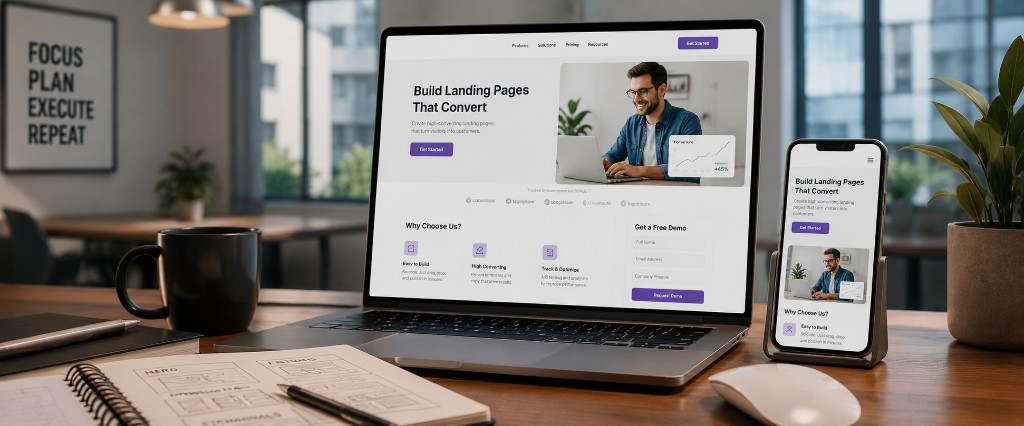
A focused landing page gives them one clear path.
One Page, One Purpose
Imagine someone searching for a roofing estimate while sitting in a Canadian Tire parking lot. Another person is comparing physiotherapy clinics during a SkyTrain commute. An online shopper discovers a promotion while drinking coffee in Port Moody.
They are not studying every detail of your business.
They are trying to answer a few quick questions:
- Is this relevant to me?
- Can I trust this business?
- What should I do next?
Your landing page should guide them toward one action, such as requesting a quote, booking an appointment, registering for an event, or purchasing a product.
Professional landing page design removes unnecessary choices and keeps the page focused on that goal.
Match the Message They Clicked
Suppose a landscaping company runs an advertisement offering spring yard cleanup in Maple Ridge.
The visitor clicks—but lands on a general homepage describing lawn care, retaining walls, snow removal, and several other services.
The offer they expected has disappeared.
This disconnect creates hesitation.
The landing-page headline should closely match the advertisement, email, social post, or search result that brought the visitor there.
Practical tip: Repeat the promise
Use the same core idea in three places:
- Advertisement or promotional message
- Landing-page headline
- Call-to-action button
For example:
- Ad: Book your spring yard cleanup
- Headline: Get your yard ready for spring
- Button: Request a cleanup estimate
The visitor immediately knows they arrived in the right place.
Put the Most Important Information First
Visitors should not need to scroll through your company history before understanding the offer.
The top of the page should quickly communicate:
- What you provide
- Who it is for
- Why it matters
- What action to take
A Squamish tour operator might lead with the experience, season, and booking button. A Mission tutoring service could focus on the student's challenge and consultation request. A clinic in Delta may emphasize the treatment, location, and appointment option.
Clear website copywriting helps turn business knowledge into language customers can understand quickly.
Practical tip: Use the five-second test
Show the top of the page to someone for five seconds.
Then ask:
- What is being offered?
- Who is it for?
- What should you click?
When those answers are unclear, simplify the opening section.
Reduce the Risk of Taking Action
Customers hesitate when a page asks for commitment before earning trust.
A renovation company may ask visitors to request a quote. A clinic may ask them to book an appointment. An e-commerce company may ask for payment.
Before taking that step, people want reassurance.
Useful trust signals may include:
- Customer testimonials
- Project or product images
- A clear service process
- Certifications or relevant experience
- Service areas and contact information
- Straightforward pricing guidance
The goal is not to crowd the page with badges and claims. It is to answer the concerns preventing the customer from moving forward.
Keep the Form Easy
A person requesting a preliminary quote may not be ready to complete a fifteen-question form.
Every additional field creates another opportunity to leave.
Ask only for the information needed to begin the conversation. For many local service businesses, that may include:
- Name
- Email or phone number
- Service needed
- Short project description
More detailed information can be collected later.
Connecting the form through CRM and form integration can also route the enquiry, record its source, and help your team respond more consistently.
Design for a Phone First
Many customers will reach your landing page while commuting, waiting for an appointment, or comparing options from their couch.
A page that looks polished on a desktop can still fail on a smaller screen.
Buttons may be difficult to tap. Headlines may take over the display. Forms may feel endless. Images may load slowly over mobile data.
Test the page on a real phone before launching it.
Make sure the main action is visible, the text is easy to scan, and the form can be completed comfortably with one hand.
Connect Traffic With the Right Page
A landing page becomes especially useful when it supports a specific campaign.
You might use one for:
- A Google Ads offer
- A seasonal promotion
- A new service launch
- An event registration
- A downloadable guide
- A featured e-commerce collection
Sending every visitor to the homepage is like inviting customers into a large department store without telling them which aisle contains the product they saw.
A landing page takes them directly to the shelf.
It can work alongside paid advertising, lead generation, and conversion rate optimization to create a more complete path from click to customer.
Give Every Click a Clear Destination
You have already invested effort in the campaign.
You created the offer, designed the advertisement, chose the audience, and paid for the traffic.
Do not let the journey become confusing at the final step.
Use one clear promise. Remove distractions. Build trust, simplify the form, and make the page easy to use on a phone.
Your customer is already looking for a solution.
A well-designed landing page helps them recognize that they have found it.
Explore landing page design services and create a clearer path from attention to action.