The morning rain has just lifted, leaving a silver shine across the sidewalk. A café unlocks its doors in Burnaby. A contractor's van moves through a quiet Coquitlam neighbourhood. In Richmond, a clinic turns on its reception lights while an online retailer prepares another stack of orders for delivery.
Each business is different, but they share one small detail that customers may notice before anything else: a logo.
It may appear above a storefront, in the corner of a website, across a uniform or on the side of a delivery vehicle. It has only a moment to introduce the business.
Does it feel trustworthy? Is it easy to recognize? Can someone remember it after walking past?
A good logo does not need to explain everything your company does. It needs to create the right first signal and give people something they can recognize when they encounter your business again.
Your Logo Is Often the First Part of Your Story
Imagine a homeowner looking for a renovation contractor.
They open several websites. One company has a blurry logo, three different shades of blue and a symbol that becomes unreadable on a phone. Another presents a simple, confident mark that appears consistently on its website, project photos, quotation form and service vehicle.
The homeowner has not yet spoken with either contractor. However, one business already feels more organized.
That is the quiet work of logo design.
A logo cannot replace excellent service, but it can influence how people approach that service. For a clinic, it may communicate calm and professionalism. For a restaurant, it might create warmth and appetite. For an e-commerce company, it can make an unfamiliar store feel more credible before a customer enters payment information.
The strongest logos begin with the business itself—not with a fashionable font or a symbol selected because it looks attractive.
Practical tip: Write three words before sketching
Choose three words describing how customers should experience your business.
| Industry | Possible direction |
|---|---|
| Home services | Dependable, capable, straightforward |
| Wellness clinic | Calm, caring, professional |
| Restaurant or café | Welcoming, distinctive, flavourful |
| Professional service | Knowledgeable, clear, trustworthy |
| E-commerce store | Modern, convenient, credible |
Use these words as a filter. Every colour, shape and typeface should support that intended impression.
A Good Logo Must Survive the Real World
A logo may look beautiful when it fills a designer's screen. The real test begins when it leaves that screen.
Picture a landscaping company applying its logo to a truck door streaked with rain. Imagine a skincare business placing the same mark on a narrow product label. Now reduce it to the size of a social-media profile image.
Does it remain clear?
Greater Vancouver businesses operate across unusually varied environments. A logo might appear against a glass storefront in downtown Vancouver, a construction sign in Surrey, a menu in Richmond, a clinic directory in Burnaby or a shipping box travelling across Canada.
A complicated design can lose its details quickly. Thin lines disappear. Small words become unreadable. Several colours become expensive or difficult to reproduce.
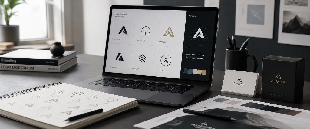
Professional logo design for growing businesses should account for those situations before the final files are delivered.
Practical tip: Use the five-surface test
Before approving a logo, preview it in five places:
- A mobile website header
- A storefront, vehicle or exterior sign
- A social-media profile image
- A black-and-white invoice or document
- A small printed item, package or business card
When the logo works in all five places, it is much more likely to support the business as it expands.
Simple Does Not Mean Generic
Small-business owners sometimes ask for "something simple," but simplicity is frequently misunderstood.
Simple does not mean selecting an ordinary symbol and placing the company name underneath it. It means removing anything that does not help the logo communicate or remain recognizable.
Think of Vancouver's skyline on a clear evening. Mountains, harbour, bridges and glass towers create many layers, yet the strongest silhouettes are still easy to recognize from a distance.
A successful logo works similarly. It may carry meaning, but its overall form should remain clear.
This is especially important in crowded local industries. Many contractors use roofs and tools. Clinics often use leaves, hands or medical crosses. Real estate professionals frequently use buildings and keys.
These symbols are not automatically wrong. The problem appears when the final design could belong to almost any competitor.
Practical tip: Perform the "neighbour test"
Place your proposed logo beside five competitors from the same industry.
Then ask:
- Does ours have a distinct silhouette?
- Does it rely on the same colours and symbols as everyone else?
- Could someone identify it without reading the full business name?
The objective is not to look strange for the sake of being different. It is to become recognizable without losing relevance.
Colour Should Reflect Positioning, Not Personal Preference
A business owner may love a particular colour, but a company logo must speak to customers as well as its owner.
Consider a wellness practice near a quiet residential neighbourhood. Soft natural tones may support a feeling of care and calm. A commercial restoration company may need stronger contrast so its vehicles remain visible at a distance. A specialty e-commerce store might use a more expressive palette to stand apart in crowded product listings.
Greater Vancouver offers plenty of visual inspiration: deep coastal greens, stone greys, muted clay, ocean blues, warm wood and the bright colours found throughout its multicultural neighbourhoods.
Local inspiration can make a brand feel grounded, but it should not become a collection of Vancouver clichés. Not every business needs a mountain, pine tree or wave.
Colour should emerge from the brand's position, audience and environment. Building a complete brand identity system helps connect the logo with typography, imagery, layouts and the overall feeling customers experience.
Practical tip: Give every colour a job
Create a small, controlled palette:
| Colour role | Purpose |
|---|---|
| Primary | Main source of recognition |
| Secondary | Adds variety without competing |
| Accent | Highlights buttons or important details |
| Neutral | Supports backgrounds and readable text |
Also test the logo in one colour. When its structure remains recognizable without the full palette, the design has a stronger foundation.
Typography Quietly Changes the Personality
Read these words aloud:
The message is identical, but each version feels different.
Typography works the same way in a logo. Rounded letters can feel approachable. Tall, narrow type may appear elegant. Heavy lettering can communicate strength. A traditional serif may suggest experience, while a clean sans-serif can feel contemporary.
For a family restaurant, overly formal typography could create distance. For an accounting or legal service, a playful handwritten font may weaken confidence. For an online lifestyle store, a generic system font may fail to express any personality.
The right choice is not simply the most attractive font. It is the font that supports the promise the business makes.
Practical tip: Test the name before choosing the font
Type the complete business name in several directions and test it at small sizes.
Pay particular attention to:
- Long names that may become too wide
- Letters that look similar when reduced
- Thin strokes that disappear on screens
- Decorative fonts that become tiring to read
A beautiful typeface that cannot be read from a vehicle, sign or mobile screen is not serving the business.
A Logo Is Not the Entire Brand
A logo is the face of the business, but customers experience much more than a face.
They encounter the colours on the website, the tone of an email, the photography in an advertisement, the wording on a service page and the layout of a proposal. When those elements feel disconnected, even a well-designed logo begins to lose its strength.
This is why a growing company often needs more than a standalone logo.
A clear set of brand guidelines defines how the logo should be positioned, which colours and fonts to use, what kind of imagery fits and how the business should communicate. These rules are especially useful when employees, freelancers or outside partners begin producing materials.
The logo becomes the starting point. The brand system keeps the story consistent.
Your Digital Presence Must Support the Promise
Suppose a customer sees an elegant new logo on a local service vehicle. Later, they search for the company and arrive at a slow, cluttered website with inconsistent colours and an unclear contact form.
The promise made by the logo breaks.
Branding and digital performance should support each other. The logo creates recognition, while the website, messaging and customer journey turn that recognition into confidence.
For local businesses, that may involve improving local search visibility so nearby customers can find the company. It may also mean strengthening broader SEO performance or organizing content so search engines and AI answer platforms can better understand the business through AEO and GEO optimization.
For an online retailer, the logo must also feel natural across product pages, email campaigns, packaging and checkout. A consistent visual identity combined with Shopify optimization can create a smoother path from first impression to purchase.
The logo opens the door. The rest of the digital experience determines whether the customer walks through it.
When Is It Time to Redesign a Logo?
A neighbourhood business may keep the same logo for years because customers already recognize it. Familiarity has value, so redesign should not happen merely because a new visual trend appears.
However, growth can expose weaknesses that were easy to overlook at the beginning.
A redesign may be appropriate when:
- The logo becomes unreadable online or at small sizes
- The business has expanded into new services or markets
- The current design looks noticeably less professional than the service
- Colours, fonts and layouts are inconsistent across platforms
- The original files cannot support signs, packaging or high-quality printing
- The brand no longer reflects the customers the business wants to reach
Sometimes the right solution is not a complete replacement. A careful refresh can simplify the shape, improve the typography and prepare better file formats while preserving familiar elements.
Practical tip: Separate familiarity from quality
Ask existing customers what they remember about the current logo.
They may recognize a particular colour, symbol or letterform rather than the entire design. Those recognizable elements can potentially remain while the rest of the logo is modernized.
Build for the Business You Are Becoming
Late in the afternoon, the café sign turns on. The contractor parks after another completed project. The clinic closes its doors, and the e-commerce team prepares the final shipment of the day.
Their logos have appeared in dozens of small moments: on receipts, screens, uniforms, vehicles, packages and search results.
That repetition builds recognition—but only when the mark remains clear and consistent.
The right logo should represent the business today while leaving room for tomorrow. It should work when the company hires its first employee, opens another location, adds an online store or begins serving customers beyond Greater Vancouver.
A strong logo is not simply an attractive image. It is a practical business asset: easy to recognize, flexible enough to use and distinctive enough to carry the company forward.
Evergrowth Digital helps Greater Vancouver businesses turn early ideas, outdated marks and disconnected visuals into logo systems built for real-world growth.