A customer finds your business while riding the SkyTrain through New Westminster.
They open your website on their phone, tap the menu, and search for the service they need. The text is small. The booking button disappears below a long section. The form asks for too much information.
They leave.
Your service may be excellent. The customer may have been ready to act. But the interface made the next step feel harder than it should.
That is the problem UI/UX design solves.
UI and UX Are Different—but Connected
User interface design, or UI, covers what people see and interact with:
- Layouts
- Buttons
- Colours
- Typography
- Forms
- Icons and visual feedback
User experience design, or UX, focuses on how the overall journey works:
- Can users find the right page?
- Does the information appear in a logical order?
- Are important actions easy to complete?
- Does the experience work across different screens?
Think of a restaurant menu.
UI is how the menu looks. UX is whether customers can quickly find the right section, understand the choices, and order without confusion.
A digital product needs both.
Start With the User Flow
Before designing screens, map the path users need to follow.
A clinic in Coquitlam may need this flow:
Homepage → Service → Practitioner → Available time → Booking confirmation
An e-commerce company in Delta may need:
Product discovery → Product details → Cart → Checkout → Confirmation
When the flow contains unnecessary pages, repeated questions, or unclear choices, hesitation increases.
Professional UI/UX design helps identify those problems before development begins.
Practical tip: Map one important task
Choose your most valuable customer action, such as booking, purchasing, or requesting a quote.
Write every step required to complete it.
Then ask:
- Can any step be removed?
- Is the next action always obvious?
- Where might a first-time user become uncertain?
The shortest flow is not always the best flow—but every step should have a reason.
Plan the Structure Before the Visual Design
Business owners often want to begin with colours, images, and polished layouts.
A better starting point is usually the information architecture.
Information architecture organizes pages, sections, content, and navigation so users can understand where they are and where to go next.
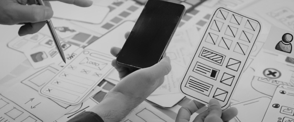
Wireframes can then show the basic structure without distracting visual details.
They help answer questions such as:
- What should appear above the fold?
- Where should trust signals appear?
- When should the form be introduced?
- Which content belongs on separate pages?
- How should the layout change on mobile?
Changing a wireframe is usually easier than rebuilding a finished interface after coding has started.
Design for Mobile Behaviour
A desktop layout cannot simply be squeezed onto a smaller screen.
Someone checking a contractor's services from a job site in Langley uses the interface differently from someone browsing on a large office monitor.
Mobile UX requires attention to:
- Tap-friendly buttons
- Readable font sizes
- Shorter forms
- Clear spacing
- Simplified navigation
- Fast-loading images
- Important actions within easy reach
Responsive design should not only change the width of elements. It should reconsider their priority and order.
For example, a desktop page may show several service cards in one row. On mobile, the most important service or call to action may need to appear first.
Build Reusable Components
Modern interfaces are easier to manage when they use a consistent component system.
A component may include:
- Button
- Form field
- Navigation bar
- Product card
- Testimonial block
- Alert message
- Modal window
Each component should have clear rules for spacing, typography, interaction, and responsive behaviour.
A button, for example, may need several states:
| State | Purpose |
|---|---|
| Default | Ready for interaction |
| Hover | Shows desktop users it is clickable |
| Focus | Supports keyboard navigation |
| Disabled | Shows the action is unavailable |
| Loading | Confirms the system is processing |
| Error | Explains why the action failed |
These details may feel small, but together they influence whether the interface feels trustworthy and complete.
Reduce Form Friction
Forms are one of the most common points of abandonment.
A customer requesting an initial estimate may not want to provide their full address, detailed budget, project timeline, and ten additional answers before speaking with anyone.
Ask only for what is necessary at that stage.
Good form UX also includes:
- Clear labels
- Helpful examples
- Inline validation
- Specific error messages
- Appropriate input types
- Visible confirmation after submission
For example, "Something went wrong" is not useful.
"Enter an email address in the format name@example.com" tells the user how to fix the problem.
Connecting the form through CRM and form integration can then route the enquiry and preserve its source without adding more work for the visitor.
Accessibility Improves Usability
Accessibility should be considered during design—not added at the end.
Practical considerations include:
- Strong text contrast
- Keyboard-friendly navigation
- Visible focus states
- Descriptive form labels
- Alternative text for meaningful images
- Buttons that do not rely only on colour
- Clear heading hierarchy
These improvements support users with disabilities, but they also help people browsing in bright sunlight, using a cracked screen, holding a phone with one hand, or dealing with a slow connection.
Better accessibility often creates better usability for everyone.
Test With Real Tasks
A design can look logical to the team that created it because they already understand the business.
New users do not have that advantage.
Give a small group of people realistic tasks:
- Find the price of the service.
- Book an appointment.
- Locate the return policy.
- Add a product and reach checkout.
Watch where they pause, go backward, or ask questions.
Do not explain the interface while they test it. Their confusion is the feedback.
Usability testing does not always require a large research project. Even a few observed sessions can expose problems the internal team has stopped noticing.
Connect Design With Development
A polished design file is not the final experience.
Developers need clear information about:
- Spacing
- Breakpoints
- Component states
- Animations
- Error handling
- Content behaviour
- API or form interactions
- Mobile adaptations
A clean design handoff reduces guesswork and helps the implemented website match the approved experience.
When a project requires custom functionality, web development turns the user flows, components, integrations, and responsive rules into a working system.
Make the Next Step Feel Natural
Customers should not have to fight the interface to do business with you.
Map the journey. Simplify the structure. Design for mobile behaviour. Build consistent components, improve accessibility, and test important tasks before launch.
Your customer already has a goal.
Good UI/UX design removes the obstacles between that goal and the action you want them to take.
Explore UI/UX design services and create a digital experience that feels clear from the first click to the final confirmation.