A customer finds your website while waiting for the SeaBus.
They read the service page, check your reviews, and feel almost ready to contact you.
Then the form asks twelve questions. Pricing feels vague. The button says "Submit," and the page offers no clue what happens next.
The customer closes the tab.
You paid to attract the visitor. Your website simply did not help them finish the journey.
That is where conversion rate optimization begins.
More Traffic Is Not Always the Answer
When leads slow down, the first reaction is often to increase advertising or publish more content.
But sending more people into a confusing website is like directing more traffic toward a blocked bridge.
Before increasing your budget, ask:
- Where do visitors leave?
- Which pages attract interest but produce few actions?
- What questions remain unanswered?
- Does the next step feel safe and clear?
Conversion rate optimization, or CRO, helps you improve the value of the traffic you already receive.
Define the Conversion First
A conversion is not always a purchase.
For a renovation company in Langley, it may be a quote request. For a counselling practice in Port Moody, it may be an appointment booking. For an e-commerce store shipping from Delta, it may be an added product or completed checkout.
Start by defining the primary action for each page.
| Page | Primary conversion |
|---|---|
| Service page | Request a quote |
| Clinic page | Book an appointment |
| Product page | Add to cart |
| Campaign page | Register or purchase |
| Blog article | Visit a service page or subscribe |
A page with several competing goals can make every option feel less important.
Find Where Interest Stalls
Analytics may show that visitors are leaving, but numbers alone do not always explain why.
A useful CRO review can combine:
- GA4 events and funnel data
- Device-level performance
- Heatmaps and scroll depth
- Session recordings
- Form abandonment
- Customer questions and feedback
- Page speed and usability reviews
For example, mobile visitors may reach a Mission service page but rarely submit the form. A session recording might reveal that the call-to-action button sits beneath a large image and several long paragraphs.
The traffic was interested. The page created friction.
Practical tip: Review one journey
Choose one important conversion path:
Ad or search result → landing page → form → confirmation
Check whether every step works on both desktop and mobile. Small breaks often hide between pages rather than within one page.
Turn Observations Into Hypotheses
CRO should not become a collection of opinions.
Instead of saying, "The page needs a brighter button," create a testable hypothesis:
If we shorten the quote form and explain the response time, more mobile visitors will complete it because the commitment feels smaller and more predictable.
A useful hypothesis includes:
- The change
- The expected outcome
- The reason it may work
This keeps optimization connected to customer behaviour rather than personal design preferences.
Strengthen the Moment of Decision
People often hesitate near the call to action because they still have unanswered questions.
A customer may wonder:
- Is this business experienced?
- Do they serve my location?
- What will happen after I contact them?
- Is there a contract or commitment?
- Can I trust the product quality?
- Are delivery and returns clear?
Use relevant proof near the decision point.
That might include project examples, reviews, guarantees, service areas, product details, delivery information, or a short explanation of the next step.
Clear website copywriting can answer objections without overwhelming the page.
Reduce Form Friction
A form should match the commitment being requested.
Someone asking for an initial consultation may not be ready to provide every project detail. Collect what your team needs to begin—not everything you may eventually need.
Good form UX includes:
- Clear labels
- Few required fields
- Helpful error messages
- Mobile-friendly inputs
- Visible privacy reassurance
- A confirmation message
- A clear response expectation
A button saying "Get My Estimate" usually creates more context than "Submit."
Connecting the form through CRM and form integration can preserve campaign data and automate follow-up without adding work for the customer.
Improve Mobile Conversion Separately
A website may convert reasonably well on desktop while underperforming badly on phones.
Someone searching from a construction site in Maple Ridge or browsing during a Canada Line commute has limited time and screen space.
Review mobile-specific friction such as:
- Oversized headers
- Slow-loading images
- Buttons placed too close together
- Long forms
- Pop-ups covering content
- Poorly cropped visuals
- Important information appearing too late
Good UI/UX design considers how priorities, components, and interactions change across devices—not merely how the layout becomes narrower.
Test When the Data Supports It
A/B testing compares two versions of an element or page.
You might test:
- Headline A against headline B
- A short form against a longer form
- Different calls to action
- Testimonial placement
- Product-page layouts
- Offer presentation
However, a small local website may not receive enough traffic to produce a reliable result quickly.
In that situation, begin with an audit, behavioural evidence, customer feedback, and high-confidence usability fixes. Testing is valuable, but not every decision needs a formal experiment.
CRO for E-commerce
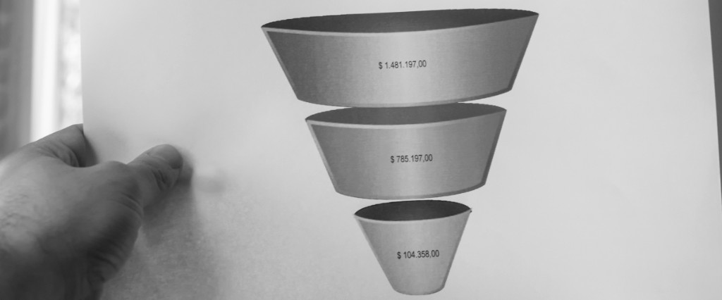
An e-commerce conversion funnel may look like:
Collection view → product view → add to cart → checkout → purchase
Each drop-off suggests a different problem.
| Drop-off | Possible friction |
|---|---|
| Collection to product | Weak images, filtering, or product titles |
| Product to cart | Unclear value, variants, shipping, or trust |
| Cart to checkout | Unexpected costs or distractions |
| Checkout to purchase | Payment, delivery, or confidence issues |
Strong product photography can reduce product uncertainty, while Shopify optimization can improve product templates, metafields, cart behaviour, and store performance.
Improve the Journey, Not Just the Button
Conversion rate optimization is rarely about finding one magical colour, headline, or pop-up.
It is about understanding why a motivated customer pauses and making the next step feel clearer.
Measure the journey. Watch how people use the site. Identify the friction, create a hypothesis, implement the strongest improvement, and compare the result.
You do not always need more visitors.
Sometimes you need to better serve the customers who have already arrived.
Explore conversion rate optimization and find the moments where more interest can become real business growth.